
Aarhaus Property Services approached Clarus Digital at the early stages of their business journey. They required a clear and professional brand identity that would establish trust, reflect the quality of their work, and stand out in a competitive property services market. Their existing logo concept had potential, but lacked refinement, scalability, and cohesion across marketing touchpoints.
We began with the client’s supplied logo, which had been created freehand, and refined it into a scalable, professional asset. This involved:
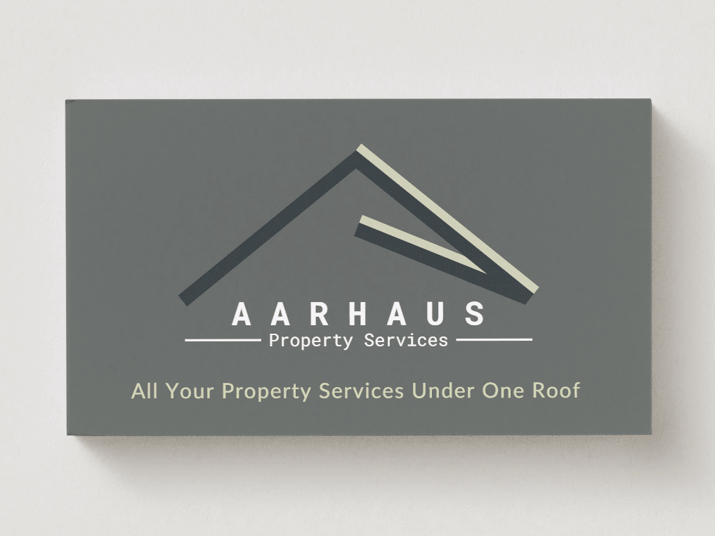
We redrew the logo for precision, ensuring it would reproduce clearly across both digital and print formats. Adjustments were made to line widths, casing, and layout for improved legibility and balance. Shadows were removed to avoid print issues, ensuring the logo would remain sharp and modern in all applications.
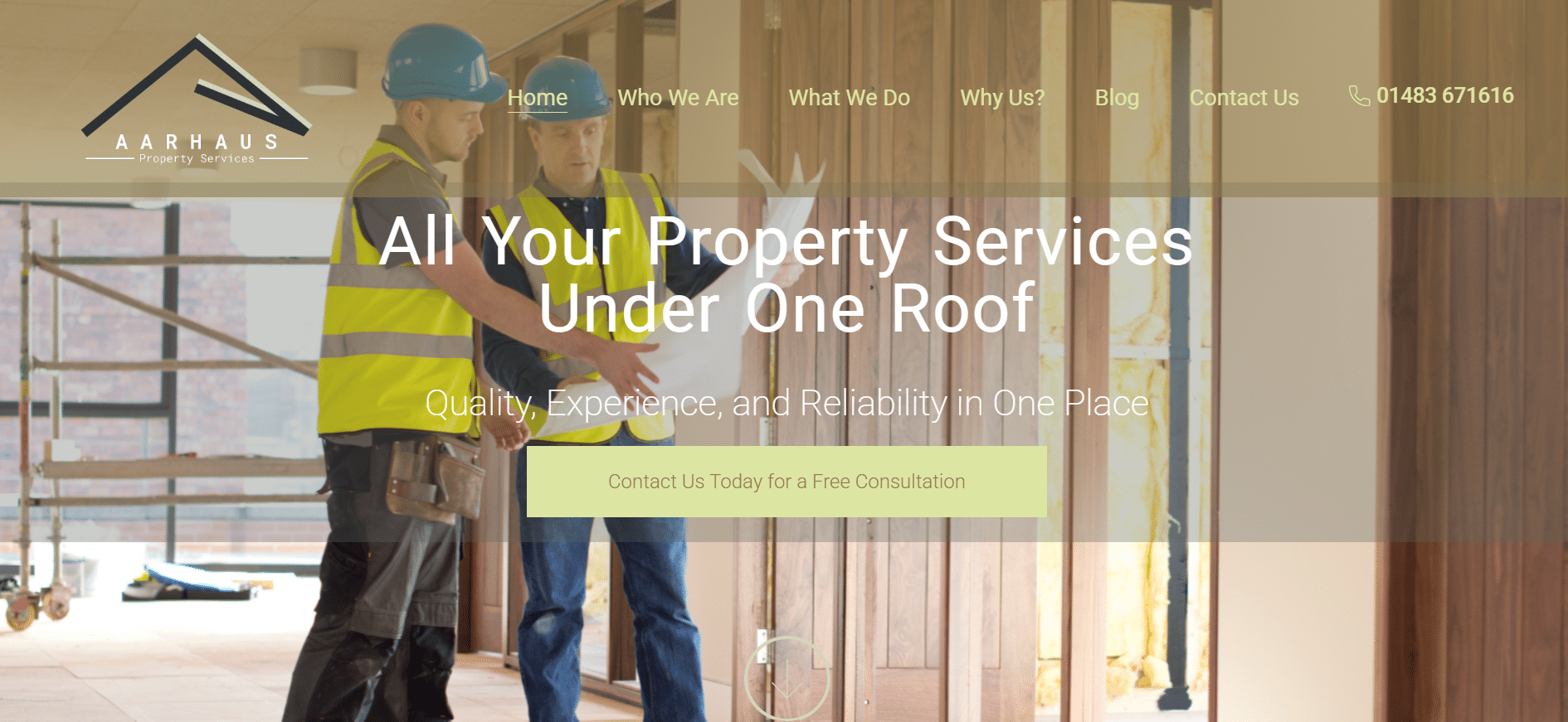
While the original logo featured a peach-toned palette, we explored alternatives that aligned more closely with the client’s industry. Through a structured brand colour proposal, we recommended a more natural and earthy palette which delivered strong contrast and harmony with property and construction themes. Options for a broader colour system were also developed, giving flexibility for website design and other marketing assets.
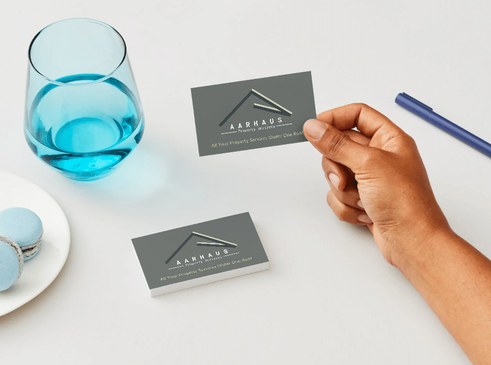
Subtle typographic refinements were introduced, including adjustments to the subtitle (“Property Services”) for clarity and professionalism. We extended the identity across essential stationery items, ensuring consistency in business cards, letterheads, and digital templates.
The final Aarhaus Property Services brand identity delivers:
Developing new brands, evolving old ones, designing new brochures that generate increased ROI or designing fresh ad campaigns that get the phone ringing – it’s at the heart of what we do.

Aarhaus Property Services Ltd.
If you like what you have read and would like Clarus Digital to do the same for your business then please get in touch.
We will reply as soon as possible.
Monday to Friday 08:30 – 18:00
Complete our form, and we will be in touch.